Usability Insights from a Placement Test Journey
When people take a placement test, they’re often nervous or unsure—and the last thing they need is a confusing interface. This research project set out to understand how real users experienced a mobile placement test: what made them hesitate, what helped them move forward, and what got in their way. By observing users as they clicked, paused, and spoke their thoughts out loud, we uncovered not just usability issues, but emotional friction that was quietly shaping their trust in the product.
Why this project mattered?
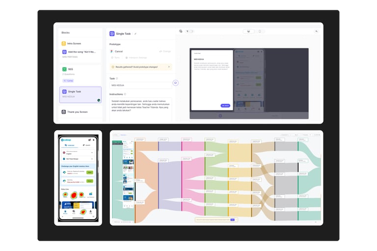
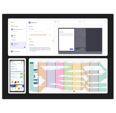
My Approach
First-click test: To see where users instinctively clicked first.
Moderated usability testing (4 users): I guided them through key tasks and asked open-ended questions.
Unmoderated usability testing (16 users): They explored the app naturally, without my presence.
Semi-structured interviews: To hear their thoughts in their own words.
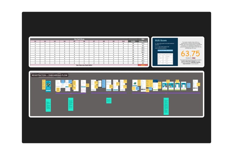
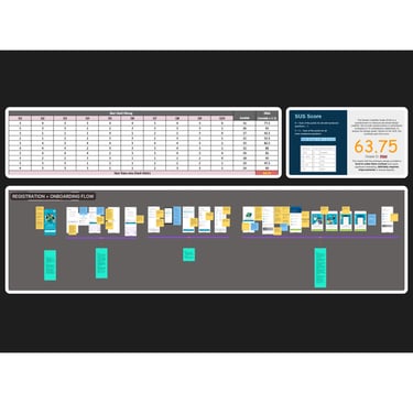
SUS (System Usability Scale): A quick survey to understand how usable they felt the experience was.
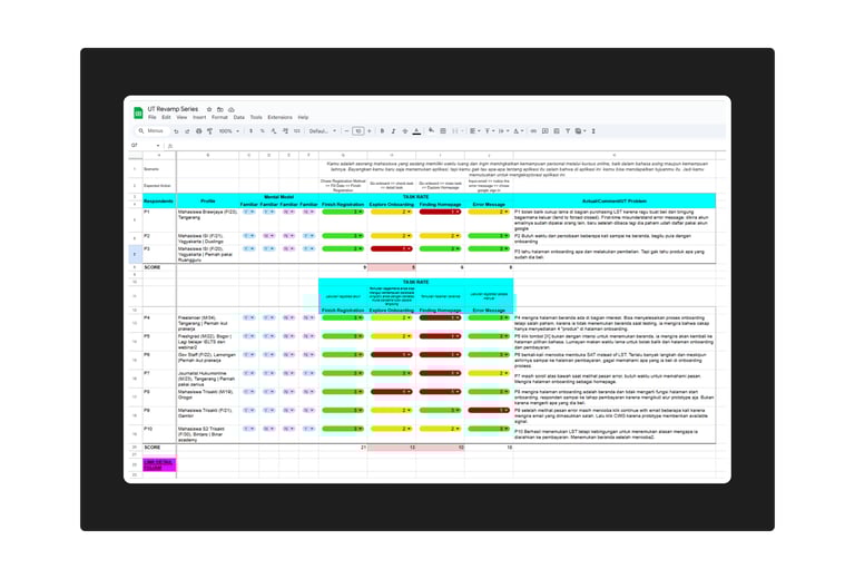
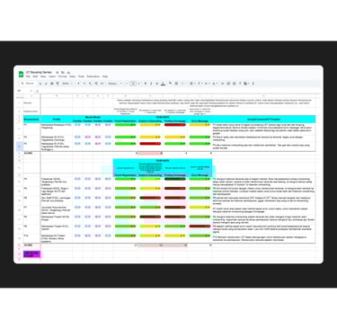
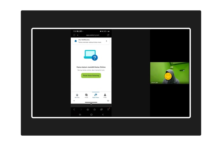
The experience was meant to be simple: help new learners discover their English level and get course recommendations. But what we discovered was something deeper—a gap between what users expected and what the interface silently assumed they knew.
Research Outcomes
I looked for patterns in behavior by reviewed recordings, notes, and click paths—then matched what users did with what they felt. This is where their pain points became clear. Finally, I shared the story back to the team—with real quotes, simple patterns, and clear next steps to improve clarity, trust, and flow. Here’s what changed because of the research:
Improved clarity on the homepage
Redesigned purchase flow to reduce hesitation and backtracking caused by unclear pricing and CTAs.
Better labeling and copywriting to manage expectations
Streamlined test report layout, focusing on what users actually cared about
Increased alignment between user expectations and the business flow
This project reminded me that interfaces don’t just deliver content—they shape trust. Every word, button, and label sends a signal. And if those signals don’t align with users' mental models, even the best features can fall flat. I walked away with deeper empathy for first-time users, and a clear belief that great design doesn’t just work—it reassures.
Project Takeaways
*Notes: Images might look a bit fuzzy or small—and that’s me playing it safe with NDAs.
I'm happy to walk you through the full story if it's for a job opportunity
© 2025. Averanita