Designing Clarity:
A Revamp Journey Inside the Cakap App
When I joined this project, Cakap’s app was growing fast—offering language classes, upskilling content, and career resources all in one place. But that growth came with a cost: users were getting lost, confused, and sometimes discouraged. We needed a structure that could scale without sacrificing usability. Being involved from early discovery to late-stage validation gave me the chance to not just diagnose problems—but make sure the solutions actually worked.
Why this project mattered?
My Approach
Started by listening inward—Stakeholder Interview.
I spoke with product managers, designers, and mobile engineers to understand not just the app’s current state—but where it wanted to go. These stakeholder interviews helped uncover long-term goals, technical constraints, and the invisible tensions between ambition and feasibility. It gave me a compass before I ever spoke to users.Then, turned outward—User Interview.
Through a series of in-depth interviews, I met with both new and seasoned users. I wanted to know: What felt intuitive? What felt frustrating? How did their experience and feelings about booking a class, finding a course, or even just navigating the homepage?
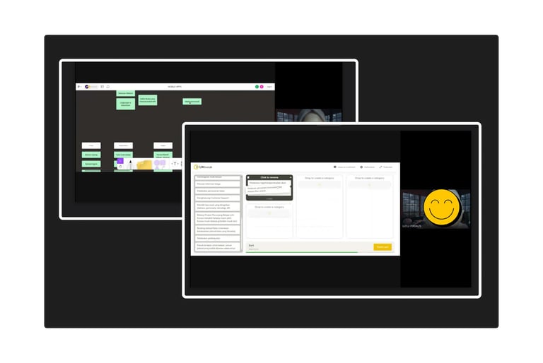
Next, brought structure to their thinking—Card Sorting.
Using open and closed card sorting, I invited users to organize app features in a way that made sense to them. It was eye-opening to see how mental models shifted based on experience. What seemed logical to one group was confusing to another—and that’s where the real insight lived.
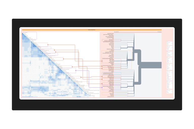
Making sense of the mess—Analysis and Synthesize.
Piles of sticky notes became data. I crunched a similarity‑matrix to see which groupings felt rock‑solid (80 %+ agreement), which were wobbly (40–79 %), and which sank straight to the bottom (< 40 %).
With Patterns in hand, I drafted recommendation for a new information architecture. Our designers transformed those IA blueprints into fresh flows and screens, but my work didn’t stop at the hand‑off.
We sliced the revamp into small journeys and single‑feature prototypes, then ran a series of moderated usability sessions. With each round, we captured both clicks and feelings—refining micro‑copy, nudging buttons, and even re‑routing an entire submenu when testers hit a dead end twice in a row.
I’ve handled revamps before—but none as demanding as this one. This was one of the most complex and layered projects I’ve worked on—not because of the tech, but because of the people. The challenge wasn’t about choosing between user behavior and business needs—but it was honoring both. Our job was to design in the tension, not erase it.
Research Outcomes
Set foundation and guideline by recommend an updated information architecture.
Improve design system and UX writing clarity as the research showed which terms were confusing and which categories didn’t align with user expectations.
Through serial usability testing, I helped the team validate and refine new flows and designs.
Rather than relying on internal logic alone, decisions around grouping, terminology, and content visibility were backed by actual user mental models and behavior patterns—reducing friction post-launch.
*Notes: Images might look a bit fuzzy or small—and that’s me playing it safe with NDAs.
I'm happy to walk you through the full story if it's for a job opportunity
© 2025. Averanita